Tuesday, November 30, 2010

The Palette: Part 2

So to finish off what I started yesterday leading up to my palette, I'll list off the colors in the in which they appear. Here's the image again as a reference:


I'll list them and explain certain groupings as I go. Initially my palette was just all the colors on the outer edges starting with white + yellow ocher (a color that no longer appears on my palette). The reason for the ridiculous amount of pigments you see piled on here is because once at Dorian's house for life drawing, Chris Pugliese made a guest appearance and he brought along his palette. That guy has a lot of paint on his palette, probably double what I have. So I went ahead and busted out paint tubes I hadn't used in years, and in some cases that I never even opened. In my ignorance, I would buy tubes of colors that appeared pretty in my eyes. "Oh look! Egyptian Violet, what a lovely color. I'm sure I'll use it!" sucker cost a lot of money. Never used it. While using this mini-beast of a pigment confetti fiesta I learned, or rather I RE-learned, why it is using less colors is somewhat better. For me at least. With so many colors to choose from, the amount of mud I create is staggering. Mud is good, yes, but maintaining a proper color harmony gets tricky when there's more than four or five pigments in any given color mixture. So now it has pretty much served as a major experiment in determining which colors I use the most and which ones I can remove.

So that I don't repeat myself in every color, I strive for the highest lightfastness level in my colors. Lightfastness is a color's endurance to light exposure as well as its inherent fading properties. Certain pigments fade after several years with or without any exposure to light. Those colors do not appear on my palette if I can help it.

1 and 2: Blue Black and Mars Black. Yes, I added black to my palette because sometimes I need a really dark value and mixing it myself doesn't always cut it. As is the case with the majority of my colors, they are a cool and warm of the color. Blue Black as replaced Ivory Black because it is more permanent and won't crack as much with age. Mars Black is the warmer black, and a really lovely color to use actually. Winsor & Newton and Williamsburg brand, respectively.

3: Titanium White (right now experimenting with Permalba white), and sometimes mixed with genuine Old Holland Flake White and made brighter by grinding Titanium White pigment into the mix. I do the latter when I want a super opaque, blindingly bright white. White is probably the most important color on any realist palette.

4 and 5: Burnt Sienna and Transparent Red Oxide. I reintroduced burnt sienna because its just an awesome warm color. I don't use it as often as the red oxide, so I prepare a smaller pile of it. The red oxide is more transparent than the sienna, so it's great for making luminous glazes. I haven't quite settled on a brand for burnt sienna, but Rembrandt for the red oxide.

6: Cadmium Red or Vermillion, depending on what I need. Both are permanent, but cad red has much more covering power. Vermillion is slightly warmer and perfect when you want subtle temperature shifts. Holbein for vermillion, not settled on cad red but using Winsor & Newton at the moment.

7 and 8: Quinacridone Red and Permanent Rose. These two reds are very transparent and more importantly completely permanent. I started using these two after reading James Gurney's post on pure Alizarin Crimson's instability http://gurneyjourney.blogspot.com/2010/04/lightfastness-and-alizarin-crimson.html. I may give the color itself another try in its permanent or hue form, but for now these two make me happy. Quinacridone red, when mixed with certain greens, makes luscious browns and amazing flesh tones. Haven't settled on any brand.

9 and 10: Cad Yellow Light and Lemon Yellow. Slowly finding little use for the first color, but lemon yellow is wonderful! Holbein.

11 and 12: Cinnabar Green Light and Viridian. The first is a opaque, warm green that makes beautiful browns when mixed with transparent reds. Viridian is a gorgeous cool green that lends to some beautiful mixtures when used. It doesn't overpower the other pigments, but it has presence. Holbein and Rembrandt, respectively

13 and 14: Cobalt Blue and Manganese Pthalo Blue. I used to hate Cobalt, now I can't live without it. All purpose blue pretty much. Makes great flesh tones, blacks, browns, you name it! Manganese pthalo blue is a ridiculously transparent color. Since it is a pthalocyanine pigment it tends towards the greenish side. Low tinting strength, but easily shifts to warm or cool. Holbein and Rembrandt

15: Magenta. This is regular magenta, so it isn't permanent but it will soon be replaced by permanent magenta or perhaps quinacridone magenta. Its a beautiful warm color, great for flesh tones. Also a very transparent color so it makes great glazes. No brand preference.

So that's my original palette. Now all the add ons...

16: Brilliant Pink. I think I saw it on Chris Pugliese's palette, or at least some similar color. I hate it. Not gonna use it anymore. No tinting strength even though it is semi-opaque. Even though it is bright and festive, it muddies my mixtures.

17: Golden Ocher: Haven't really given this color a fair run yet.

18: Cadmium Yellow: Possible replacement for Cad Yellow Light. It's warmer and I've found myself dipping the brush in there a whole lot more. No brand yet.

19: Yellow Ochre Light: new permanent addition to my palette, replacing traditional yellow ochre. It is lighter in tone, which I personally like a lot more. Mixes easily, permanent, and great covering power. Rembrandt.

20: Naples Yellow or Jaune Brilliant, or occasionally a mix of both: I have a lot of naples yellow leftover from art school, so I thought I'd give it another chance. Still don't like it.

21: Greenish Yellow: This little gem... oh man how I love it. Beautiful transparent green, when mixed with quinacridone red makes a heavenly golden brown glaze. Nuff said! However, I don't know if it is permanent since Holbein colors are hard to read since they're in a different language and there's no visible markings for lightfastness. Cinnabar Green Pigment is it's permanent (in the color sense) replacement until I find out.

22: Turquoise: Gorgeous color, but not very useful in regular painting. Nice accent color though. Holbein

23: Pthalo Turquoise: Same as above. Rembrandt

24: Pthalo Blue: The mother of all tinting colors. This mofo will get into every other color even if you don't put any on your palette. But my Lord it is a beautiful color. Warmish blue, superior tinting strength, beautifully transparent, and photographs like a champ according to Donato. I don't use it often, but it does make occasional appearances when I need a blue that wants to be noticed. Williamsburg

25: Ultramarine: It was on my palette in place of cobalt for a while and has found its way back. I love this blue. Transparent, warm but can be cooled easily (temperature is really all relative anyway), makes beautiful darks and great glazes. Williamsburg and Rembrandt

26: Egyptian Violet: I have absolutely no use for this color as of now, but its a Williamsburg color.

A and B: MUD! At the end of every painting session, I scrape up and mix all the mixtures I used. It it is dark, I put it in the A area, if its lighter it goes in B. This mud gets used constantly to alter and knock down the chroma of a certain mixture. Or I can use as is in many cases. I don't like wasting paint.

C: Transparent Red Oxide + White. Its just a tint. I use it so often with white mixed that I figured why not save myself the time and just mix a pile of it to start with and run with it.

So that is my palette right now. I plan on downsizing it to a more manageable number of colors, but this'll do for the time being.

As far as brands are concerned I don't attach myself to one. Each brand has their own pros and cons. If I could afford Old Holland paints, I would buy them since they are ground in natural cold pressed linseed oil and not alkali refined oil, tothe best of my knowledge. But they are no where near my price range. Until then I PREFER transparent colors from Winsor & Newton and Rembrandt and opaques from Holbein. I also use Williamsburg which is a step down from Old Holland. They're not as expensive, and their colors don't always mix nicely, but they do have some gems like Ultramarine Blue and the Cadmiums.

Tomorrow I'll discuss the Old Master palettes that influenced me the most; Rembrandt and especially Bouguereau. Thursday will be devoted to the contemporary masters who really got me thinking about color in a different way. And Friday will be first friday self-portrait day :)

Monday, November 29, 2010

The Palette: Part 1

Hello all! It has been over two weeks since I last posted, but things have been pretty busy on my end. This week I'd like to delve into matters pertaining to the artist's palette. Every aspiring, and even professional artist is drawn to the color choices used by masters past and present. Our curiosity leads us to experiment with various pigments and over time this develops into a very personal, unique set of colors comprising that individual artist's palette. It becomes as personal as one's style. To start this whole shebang off, I'd like to give a little history of the evolution of my palette along with the trials and tribulations of my paintings that led to where I am today. If anything the examples I show of my old work will hopefully make you laugh, not because they are funny, but because they're quite horrendous :)

I've been painting in oils for about four years now, roughly since second semester of my junior year. For those who knew me then, you'll recall how miserably awful my work was. Maybe I was too slow in making the transition from strictly graphic design to traditional, or perhaps (and this is most likely the case) I really just had no freakin' clue how to use color. My fellow illustrator friends were already leaps and bounds ahead of me, completing projects with ease and creating magnificent pieces of art, all the while I struggled in every medium to catch up and at the very least have my assignments look presentable enough in their block-in stage to please my instructors. It was a pretty demoralizing affair, truth be told.


Fairy Tale in a different time period assignment. I did the Frog Prince influenced by Aztec civilization. You can tell right....


Final project for illustration painting class where we could do what we wanted, creating it for the market we wished to be a part of. In my case it was fantasy. This painting was a valuable lesson to not use Crystal Clear as an in between speed drying medium for oils. Ignorance is bliss, but that was just plain stupid!
A note on that grayish border: I currently use this painting to place smaller masonite boards on top of when I gray gesso them. Reduce, Reuse, Recycle everyone :)


Book cover assignment. "American Gods" by Neil Gaiman. I did absolutely no justice to his story whatsoever. Sorry Neil!

In all these you can see the state in which I brought my pieces for critique. In some cases I had more than a week to finish the paintings. Yup, not so much.

But for some inexplicable reason I persisted. Something about colors mixing, happy accidents occurring while I painted (none of which I could replicate at the time), warm and cool harmonies dancing on the surface tempting me ever so gently to carry on. "Go man! Go!" my paintings would egg me on in a very British, Eddie Izzard voice. Suffice it to say, I did not complete a single painting until my last semester in art school, right about when my brain said "Hey dickhead! You need to graduate so get your shit together pronto!"

So I took an oil painting technique class with the awesome Anthony Apesos, whose anatomy book I wrote a review of in a very early post here:
http://painterification.blogspot.com/2008/09/anatomy-for-artists.html
But anyway, I took his class and learned about the history of oil painting and all that jazz, as well as various techniques. I will go in depth with such information in a later post. For now I will only mention his introducing us to the palette of legendary Greek painter Apelles. You can google or wikipedia the artist, but long story short this was the beginning of my long and continuing research into artist palettes in the hopes of finding my own personal palette. Apelles, according to Tony and his sources, used a palette of four colors (very similar to the palette of Anders Zorn actually) consisting of, for our modern purposes: titanium white, lamp black, yellow ochre, and light red (pigment PR101 or 102 depending on manufacturer, also called Venetian Red). According to legend, Apelles was able to paint just about anything with those four pigments. So that was our first big assignment. And golly gee let me tell you, I learned more using just those four colors than being swamped with the full color palettes from previous classes. All the colors that you can mix are optical approximations of the intended color. Everything is relative. When you mix white and black, yes you get gray (Duh!). But when you place that gray next to a really warm mixture of yellow ochre, light red, and white it reads as a blueish tone.

Magic! Literally, in my eyes that was magic. I couldn't believe that such a simple arrangements of earthy pigments could lead to such brilliant results. And to think that a lot of the Old Masters used such limited palettes to create their masterpieces, that just flat out blew my mind! So here is my first big painting ever executed with the palette of Apelles. After the whole thing was pretty much worked out with that palette we were allowed to introduce accent colors (such as Sap Green and Cadmiums).


It's about 18" by 30" I believe. I show this here for the first and final time. It will be painted over with something better, I hope at least.

So I graduated art school, got my BFA in illustration, did a few jobs here and there, got a job, all that stuff. But my urge to know more about colors continued to boil within me. My very first palette was the one suggested to us by teachers. It included Cadmium Red Light, Alizarin Crimson, Cadmium Orange, Cad Yellow Light, Yellow OChre, Permanent Green Light, Sap Green, Ultramarine Blue, Cobalt Blue, Dioxyzine Purple, Burnt and Raw Umber, Burnt and Raw Sienna, Ivory Black,and Titanium White. A strong palette, but it didn't resonate with me. It was a helluva great starting point though. I began to pay closer attention to the artists I admired, namely Bouguereau and Donato Giancola. The French Academic maestro of sheer awesomeness and the fantastical, narrative driven contemporary master of pure amazingness! Just look them up and you'll see why they require their titles.

But as my tastes in art matured, I began looking further back. Rembrandt, Velasquez, and Rubens are my top three of all time. But there are others like Sargent and Sorolla, Repin and Fechin, Normal Rockwell and other great illustrators who I looked to. The modern masters of figurative arts like Richard Schmid, Dorian Vallejo, Jeremy Lipking, and Robert Liberace all came into my peripheral moreso than when I was a bumbling art student. Needless to say, I have spent a fortune on paints (five finger discount came in handy when I was a broke art student. Don't judge me, I'm not proud). After years of experimenting and dabbling with different colors I have recently come upon a palette that suits my needs as an artist. I present to you the most recent incarnation of my color palette:


Twenty-nine colors in all; 26 straight from the tube + 1 tint + 2 mud piles. In the second part of my palette posts I'll elaborate on why I use these colors, why there are so many, and who influenced me in my decisions. For now I leave you with these last two images done in gouache, when Tony DiTerlizzi was my idol (these two are epic failures as well)


Friday, November 12, 2010

Stuff

Today's post will have a few images in lieu of my lack of posts throughout the week. First I'll show a drawing I did at Dorian's house a couple weeks ago. It was done with Pan Pastel and graphite on hot press watercolor paper, about 12" x 16."


Second, and most importantly, I finally finished a painting that I had started in August. You can see it in the early stages in a previous post http://painterification.blogspot.com/2010/09/some-works-in-progress.html along with a couple other pieces I'll be showing in this post. I'm really happy with how it came out and all thats left to do is frame that bad larry. I'm thinking of getting an oval matte for it too, it'll look nice.


Third is an experimental self-portrait I did a while back. I was playing a lot with thick applications of paint and how they mix on the surface. There's a lot of things I liked and learned that I apply to my work now. Conversely there are a lot of things I will never do again. The palette of colors is the actual palette I used. It has since grown significantly to about 30 some odd colors. Starting from the right: Titanium White, Yellow Ochre (has since replaced by Rembrandt yellow ochre light), Transparent Red Oxide, Cadmium Red, Quinacridone Red (http://gurneyjourney.blogspot.com/2010/04/lightfastness-and-alizarin-crimson.html I replaced alizarin crimson with quinacridone after reading this, and several other, posts by James Gurney), Cadmium Orange, Winsor Yellow (Cadmium Yellow Light is a good equivalent), Lemon Yellow, Greenish Yellow (a color I picked up after reading about Dan Dos Santos's favorite colors. Love/hate relationship with this one), Viridian, Cobalt Blue, Manganese Pthalo Blue, and Magenta.


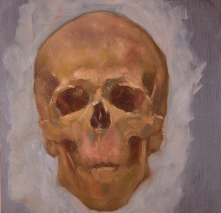
Finally I have a self-portrait started over the summer. I had begun the painting using the CSO painting medium I discussed in a previous post (the skull 3 hour study) but at the time I didn't really know how to use it. Because I wanted to execute the painting entirely with the CSO mixed paints, I set it aside until I could grasp how to use it successfully. It was a trip to my friend Dorian Vallejo's house one evening to show him some of my paintings that got me excited to jump back into this one. He loved it, and I was more confident about the CSO. And thus, I put it on my easel again and began working. Anatomy was completely off from my initial work on it, so I began fixing it and I'm still working to make it look believable. This is what I have so far and I'm incredibly happy with it. Enjoy!


My plan (wishful thinking) is to finish the cigar self-portrait as well as a commissioned portrait that I'll show when completed, all by November 15. I can definitely put a major dent in my work this weekend since I took today off and have the whole weekend to just paint. After all the work is done, I'll have about 10 pieces for my portfolio for grad school and it will free up about 2 months to work on a couple more ambitious paintings that'll really raise the bar for me as a painter. I'll post sketches for one of them next week. Any and all feedback is welcome. Have a great weekend everyone

Friday, November 5, 2010

First Friday Self-Portraits


So I decided that every first friday of every month, I'm going to post a self-portrait. It may be in the form of a fully realized painting, a one day oil painting, a quick sketch, drawing, whatever. So to kick start this whole thing, I painted myself yesterday over a previous failed self-portrait. I blocked it in quickly the night before after finishing up the day's work on a portrait commission and then worked on it yesterday. All told, it took about 7 hours give or take. Its oil on canvas mounted on masonite. Looking at it now there's a few areas that could have been approached better, so I may go back into it once its dry later on in the day and touch up some areas. This was officially the first time I used my new palette of colors, inspired by Chris Pugliese's beast of a palette after watching him paint at Dorian's. I don't know which colors he uses exactly, I failed to ask. But Brilliant Pink, Turquoise Blue, and Cinnabar Green are my new best friends. Enjoy!

Wednesday, November 3, 2010

Pan Pastel experiment 2

Sorry for the delayed post. I'm behind two, hehe. This is my second stab at Pan Pastels. Love this stuff! Model is Marisa who I have used before and is probably the most recognizable face in my work. Good friend, great model! Enjoy!


Here I lightly mark in her gesture and proportions


Blocking in larger masses


Continuing to refine, did her face in pretty much one shot no looking back


Close up of her face


Almost done


Not the best picture, but this is the finished result. I left it in my studio for a few days without looking at it saying I'd come back to it. When I did go back to it, I realized there wasn't much I should do, so I'm calling it done. Very happy with the results.

For your viewing pleasure, a bonus image of Marisa. This is a small 5x7 inch study I did as part of a class I'm taking at work. THe instructor is Robert Kogge and he developed a fascinating technique using colored pencil on raw canvas. Here's my first attempt at it, only I went ahead and added oils. The softness of the colored pencil on canvas is completely lost when I applied the matte medium to seal the surface. But I tell you what... it makes for one helluva great underpainting. I was able to bring all the color back and some in no more than 45 minutes.

Wednesday, October 27, 2010

Representational Painting class

To keep with my proposed plan of updating the blog three times a week, here is my Wednesday post. Alex Piccirillo is an art instructor at the Yard School of Art where I work (part of the museum) and has been there since before the museum took it over. He is also a celebrated Master Pastelist and all around amazing individual. You can see some of his work here:http://www.gallery51.org/artists.php?artist_id=59

He's a self-proclaimed student of the Ashcan School, specializing in images of normal, everyday people doing what they do. Having been a trained boxer in his youth, he is also an authority on boxing history and creates powerful images using the subject matter.

Thats the man himself. I mention him because the class I teach was started by and taught by Alex for many years. Throughout the year he's had a series of surgeries to heal an open wound left over from an earlier procedure to remove ankle hardware. Him and I being good friends, he made sure I took over his spot. So without any more yapping, here are some images from last week's class. It was the last night with our lovely model Melinda. Hope you enjoy.


These were some shots of them working in progress. They're a very strong group, many have years of painting experience under their belt while a couple are young aspiring artists. Some take the class because they like making art for fun (don't we all) and it is their hobby, others want to further their skills and pursue it professionally. To those who have never painted or have very minimal painting experience I suggest using the Zorn palette. While it takes a thorough knowledge of color theory and painting in general to master using just the four colors, it eliminates the clutter of having too many colors to choose from forcing them to make calculated decisions about value and tones. Fellow artist and friend Aaron Miller has started a great blog where he posts information on the individual palettes of artists, living and long gone. Here is a link to his post on Zorn, which in turn has more links to info on the artist:
http://oilcolorpalettes.blogspot.com/2010/06/limited-palette-of-anders-zorn.html

And here are their finished images. Colleen did a painting but was away having fun at the Rose Frantzen workshop the previous week, so for her last day with this pose she decided to start a very nicely executed charcoal drawing. Ronnie, always pushing herself, finished her oil portrait and then did a smaller study (which we both decided in the end had more life and character). Unfortunately a few of the students were not available on that day to photograph their finished pieces.

Colleen


Ronnie


Emily


Hana


Jane


Karen


Sylvia

Monday, October 25, 2010

Pan Pastel experiment 1

I'm going to try to update my blog at least three times a week, M-W-F preferably. Sort of following the posting model of Paolo Rivera. This is mainly in my attempt to make this more of a serious art blog with information and what not instead of just personal ramblings. So for today's post I'll give another step by step demo, this time chronicling my first drawing with Pan Pastel. If anyone knows of Brooklyn artist David Jon Kassan you know he uses this stuff quite frequently and is frankly a master of the medium.


Unfortunately I didn't think to make this a step-by-step till about an hour into the drawing, but this is how it looked after the first hour. Excuse the quality as well, the first 3 images were taken with my cell phone. This is done entirely from life with an actual human skull that I borrowed from my job (and have yet to return, hehe) I started it like I would any other drawing; with light, barely visible gestural lines. I then started finding the major dark shapes and blocking them in. Interestingly enough I found that using the pan pastel I can draw similar to the way I paint, which is a nice bonus. The shadow values get massed in with large strokes and then with my kneaded eraser I start finessing the drawing and picking out lights, carving away at the form.


Second go around, this is the drawing after another hour. I'm picking out more lights and little nuances with my eraser, but now I've also started going in with my pencil to get the really fine detail. At this stage I'm rendering cracks and sutures separating the different bones of the skull. Again not as easy to see since its a cell phone pic. I've started working on the teeth as well, getting in the basic overall shapes of the light and dark


This is probably the same stage as before, but I actually took a picture with my camera. I included both because I'm not too sure :)


This is the finished drawing, taken with my camera so you can see some of the detail and rendering. All in all it took about 4 hours to complete, give or take. The process of drawing is similar from start to finish for me. I push and pull the lights and darks. Another important factor in being an artist is that we get to choose what to include and omit. While this is one of the most detailed drawings I have done in a very long time, a big part of that believability is that I didn't show EVERY single piece of information that I saw. There are far too many cracks, holes, stains, and other minutiae on that skull for me to have rendered. The drawing would have lost it's life.

So in closing, I'm very happy with the end result and am proud to include this in my portfolio of grad school images under the life drawing requirements. Wednesday I'll post images from my Representation Painting class, which I teach on Wednesday evenings. Until then, I bid thee adieu and have a great day!

Saturday, October 16, 2010

3 hour study

Hello all. I don't think I've mentioned it before on the blog, but over the summer I undertook a time consuming process to cleanse and sun-thicken my own linseed oil directly from cold pressed, unrefined flax oil. The benefits, you may ask? Well commercially sold linseed oils dry slower than snails crawl, they're chemically refined, and they just don't really compare. The home-made sun-thickened oil I made dries within 30 hours and is completely pure and simply a delight. My step-father has joked countless times that it's "organic" linseed oil, since it is untainted by any alkali and other stuff.

All this is thanks to my friend Louis Velasquez, an art teacher and artist from San Diego, who took it upon himself to find out what the old master's used. He doesn't claim that his medium is THE Old Master's "secret" medium, he can only guess at that himself and as we have both said, they really were just amazingly knowledgeable with their craft. But his research is extensive and has taken up the better part of 10 years or so. And if you look at some of their paintings, in particular the works of Van Eyk, Rembrandt, Rubens, Velazquez, just to name a few, their work show an incredible freshness and preservation considering they're 100s of years old. Rembrandt's in particular look like they just came out of his studio. Bastard!

For my part, I have read a few books specifically on Rembrandt and Velazquez (the two old masters I admire the most) and I can say that Louis's research comes pretty close to what cross-sections of their paint samples show is in their paint. For the most part, oil, calcium, and proteins are the most common ingredients (Rembrandt was ahead of his time in using sand, glass, and God knows what else to achieve his desired effects). Its completely archival and non-detrimental to one's health, as well. Bonus!

So that said, mixing some of the oil with calcium carbonate leads to a thick, viscous medium that when mixed with paints adds transparency to the colors and gives it more body. Oiling out, you take an egg white/oil mixture, called an emulsion, and rub that on the surface and then work into that. NOW... all this is for the sake of permanency and working without any solvents and resins, which in the long run and if in an unventilated room is pretty bad for your health. And as I mentioned, its completely archival.

I've experimented with the medium and emulsion and initially I was not a fan. Particularly of the emulsion. The oil itself is friggin awesome, and those I have given samples to attest to said awesomeness. Having painted for many years using various mixtures of solvents and resins with oils and what not, I became used to the soft, washy effects that I could achieve early on. That was not possible when using this stuff. In effect, I was discouraged. But last night I slowed down and worked a tad more methodically than I'm used to working. But the end result blew my mind. So here is a nice step-by-step progress of last night's painting.

I worked how I normally worked, except I was more careful in my application. My color mixing remained spontaneous so that a lot of random bits of colors and happy accidents still occurred. To those who read my blog and may not be painters, and even for those who are painters and just like seeing how others work:

My palette is arranged as follows: Chinese Vermillion, Cad Red Light (sometimes just Cadmium Red instead of those two), Quinacridone Red, Permanent Rose, Cad Orange, Winsor Yellow, Lemon Yellow, Greenish Yellow, Viridian, Cobalt Blue, Manganese Pthalo Blue, Magenta, Transparent Red Oxide, and a Titanium White/Flake White mixture enhanced with extra Titanium white ground pigment (its a really bright white)

I first lightly drew in the skull with a mix of transparent red oxide and cobalt blue. Once finished, I began blocking in the major shapes of light and dark working from top to bottom. At this point I'm concerned with exaggerating the colors I see so that as I layer over that, it shows thru and enhances the overlaying color. Working slowly and patiently, I study the shapes and redraw as I see fit. I keep the shadows transparent and the lights opaque. The main colors used for the warm light areas are different mixtures of white, cad red light, quinacridone, all the yellows, greenish yellow and magenta. To cool areas down I used manganese pthalo blue and viridian.

The nature of this medium allows for literally glazing wet into wet. So once some of the colors were pretty set, I began glazing warm and cool tones over some areas and worked into those glazes. I just continued pushing and pulling the lights and the darks, the warms and the cools. Certain colors were exaggerated, for instance the blues in the shadow and some of the reddish shadows turning the form. The finishing touches were added by dipping my brush into the emulsion and mixing a puddle of syrupy color on my palette and applying that in thicker, juicier strokes. By the end of the 3 hours, this is the result.
As of this writing, the paint is tacky, but doesn't rub off on the skin if touched.

For anyone who wants to read more about the whole process and if you have questions for my friend Louis, I suggest visiting his website http://www.calcitesunoil.com/ I really can't wait to start working larger with this stuff!


Thursday, September 23, 2010

Thoughts on the fragility of life

Tonight my mom's best friend Carmen passed away after a battle with liver cancer. I didn't know her very well, but the few times I met her it was evident what it was about her person that resonated so strongly with my mom. They met thru a real estate transaction when my mom sold her a building a handful of years ago. This very unassuming, humbly dressed, down to earth woman shook the very foundations of everything my mother believed to be associated with wealthy people. Surely they all drive luxury cars and wear designer clothing right? I mean, what's the point of having all that cash if not to lavishly spend it on completely unnecessary things?

Here's what I know about Carmen. She came from Peru I don't know how many years ago, didn't speak the language (still could barely speak it), and with her siblings opened up a restaurant in NY. That one restaurant led to about two others being opened, all with some of the most authentic latin cuisine that money could buy. This lady, born into a very poor, antiquated world where women were meant to stay at home, take care of the house, and please their men, defied the rules and customs of her people and became a very successful entrepreneur. Despite the terrible drama that unfolded with a divorce from a man who doesn't deserve to be treated better than a cold-blooded murderer, she held her head up high with only the well-being of her three children on her mind. That, and money never got to her head. She had it, but didn't need to show it. She was a perfect model for the kind of person my mother wanted to be, and I'm thankful everyday for the friendship that existed between the two.

My mom's not one to keep many close friends and a lot of times they turn out not being very much in the way of friends anyhow. Money leads to greed leads to jealousy leads to friend infidelity. So for her to have someone who just loved to sit and chat about anything and everything, never cared for gossip or bullshit, and truly loved life and her family, it made her very happy. She was a different person with Carmen. In her last weeks alive my mom spent a lot of time with her, helping her sister take care of her and just spending quality time with her friend. She never let her sickness bring others down, always preferring to keep it to herself. Yesterday the three of them spent the day outside picnicking while it was gorgeous. And today, Carmen left the world surrounded by the people she most cherished. So now all that is left are the fond memories that her family, friends, and my mother have with her.

And it is because of this event that I write this post. Life is too short to worry about silly things like artifice and wealth. Too many people seem to think that material things leads to happiness. There are far more important things that we are blessed to have, and in reality is all we need. Love, above all, is what drives me to be who I am and is the reason why I have a sunny disposition. Believe in whatever deity you wish. Hell, you can be an atheist, it doesn't really matter. But as long as love exists, I think anything can be overcome and life be much happier. Carmen gave a lot of love, and even with the wealth she had she never lost sight of where she came from and who she was.

We should all take time to just appreciate and love the life we live, the people we know, and the things we already do have. We are richer than we think when we're able to really prioritize what is important. Don't let little obstacles stop you from pursuing your dreams, anything is possible if you love yourself and really want it. And with that, I wish you all a lot of love and good night.

RIP Carmen... Gracias por la amistad que le diste a mi mama. Por gracias de ti, ella hoy en dia es una persona mejor y mas fuerte. Y puedes descansar sabiendo que tu familia te quiere muchisimo y que siempre te extrañara. Yo se que mi mejor amigo Danny esta arriba con usted, cuidandolo a nosotros. Descanse en paz!

Friday, September 17, 2010

Some works in progress


A shot of my studio as it looks now, with a big peg board installed on the far wall. Helps me work on multiple images at a time, thus freeing up both my easels and my drafting table for other works. Plus it covers up that gawd awful green! The rest of the images are things I've been working on for the past two days. Its been an incredibly productive 48 hours. The nude with the pink galxyish swirly stuff behind her is 23x23, oil on Strathmore 500 and will be my submission for the Tata Gala, hopefully it gets in! I've included the finished drawing and some progress shots of the oil painting itself. The galaxy I did Wednesday morning after rewatching Donato's instructional DVD. Love that man! And the nude back is a restarted painting. If you look on my studio wall you can see the original one started from life. I took photos to finish it at home and while working on it I found so many horrifying errors and the way I was painting didn't allow for easy corrections, so I scrapped it and started over. I drew it out on illustration board and started the oil painting Thursday evening. Enjoy!